Roadside is inherently complex, often involving a wide range of players – intake agent, service dispatcher, service provider, follow-up customer support, and more – to quickly and effectively help a stranded customer. The most effective way to ensure a clean digital experience is through a single integrated platform, like Swoop, that can provide the relevant information to each party in real time. However, this means that a diverse set of users will all need to access the same platform. Adding further complexity, we are continuously adding features and improving the platform with our distributed development team.
As a design team, this has posed some interesting and exciting challenges:
- How can we ensure that the experience is coordinated and consistent across the platform?
- How do we structure our design to create intuitive experiences?
- And how do we continue to build out our system in a way that will support whatever we might need to do in the future?
The Swoop Design System
Like Spotify, Uber, Airbnb and many more, we recognized that we needed to develop an integrated design system that can support our team and our product. This thoughtful collection of components will make it easier for our development teams to rapidly create consistent, high quality experiences. We started building our design system in October of 2019, and it is an ongoing effort as we continuously evolve and expand it to meet the needs of our product. Designers Andrew Green and Jeff Janes have been critical to our success with the design system, constantly refining design iterations. Ask any designer who has built a design system from scratch – it's hard work!
The main goal of this design and engineering exercise: Cleaner components will lead to easier front end development and improve our platform's flexibility, scalability, and usability through refined design language. This common design language will save development time, and ultimately help us scale efficiently.
.gif?width=1200&name=BlogImage_DesignSystem_Jan2021_1200x628%20(1).gif)
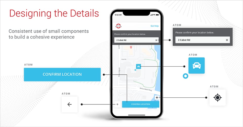
We chose the Atomic Design approach to create our design system. This process breaks components down into the smallest actionable component, called atoms, and then creates bundles and collections, known as molecules of these components all the way up to full layouts.
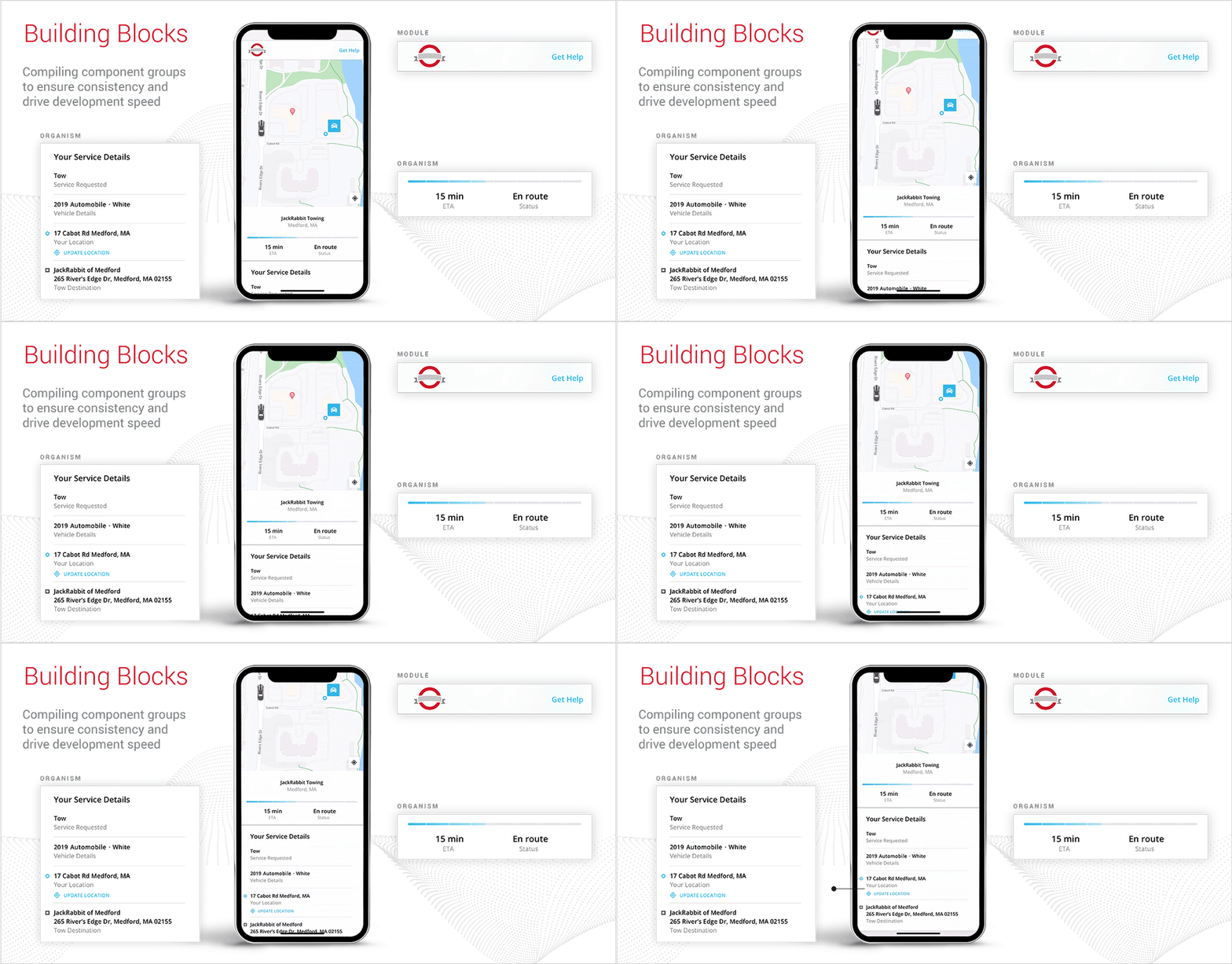
Our primary objective was to ensure a consistent and intuitive experience. For instance, while the icon libraries may expand, the icon size and style remain consistent. We then built a series of common combinations, called molecules, based on the current needs of the platform. We even created full-page designs, called organisms, for the most common use cases.
Swoop Design System in Practice
One of the features that was recently released on Swoop was our updated customer roadside communication platform. This enables customers to stay informed throughout their roadside event, including job details, status, and truck tracking throughout the event. Because no one ever plans to have a roadside event, we want to make it as simple and clear as possible for customers to understand what’s happening throughout the process. Considering the complexity of the information that we share with customers, we need to align multiple screens and experiences. Our design system was critical to the success of this implementation.
Our smallest building blocks, atoms – colors, spacing, fonts, buttons and icons made it simple and straightforward to ensure consistency as we moved from concept to development.

In addition, we leveraged the mobile design groups, molecules. This accelerated development while ensuring that the final output had a cohesive look and feel.

Next Steps
But we are just getting started. This effort is a result of an ongoing cross-squad collaboration between engineers and designers and we are thankful to our whole team for this powerful tool, enabling our scale and development. Our design system evolves in tandem with the needs of our clients, customers and business. We’re continuously refining components and compiling new layouts to help simplify and streamline the innovation process. Most importantly, this design system helps keep the user experience intuitive and clean, so customers are informed every step of the way right up until they are back on the road and enjoying the ride.
Sources:
https://www.invisionapp.com/inside-design/guide-to-design-systems/
https://atomicdesign.bradfrost.com/chapter-2/


.gif?width=1200&name=BlogImage_DesignSystem_Jan2021_1200x628%20(1).gif)


 Judy Rodman leads the UX Design team at Agero, collaborating with Product and Engineering teams to deliver clean, intuitive experiences. Since joining in 2009, Judy has been a key contributor on a range of products that support Agero's roadside business. Currently, her team supports the Swoop roadmap, integrating key user insights into design decisions and crafting impactful refinements. When she's not working, Judy enjoys spending time on Cape Cod with her family. Judy holds a BFA in Graphic Design and Business Administration from Boston University.