Most customers experience a roadside event once every 2 years. Even then, many customers don't use their roadside assistance program at all, or use an old fashioned 800 number because they forget or don't know how to use a digital option. Given the infrequent and chaotic nature of roadside events, intuitive and seamless digital experiences are critical. Here are some best practices we’ve learned through partnership with our clients and through our own digital development.
To cut through all this resistance and support customers in need, you need an easy to access, intuitive experience.
At the highest level, this means easy to use but it is a little more nuanced than that. Intuitive design is generally built on these principles:
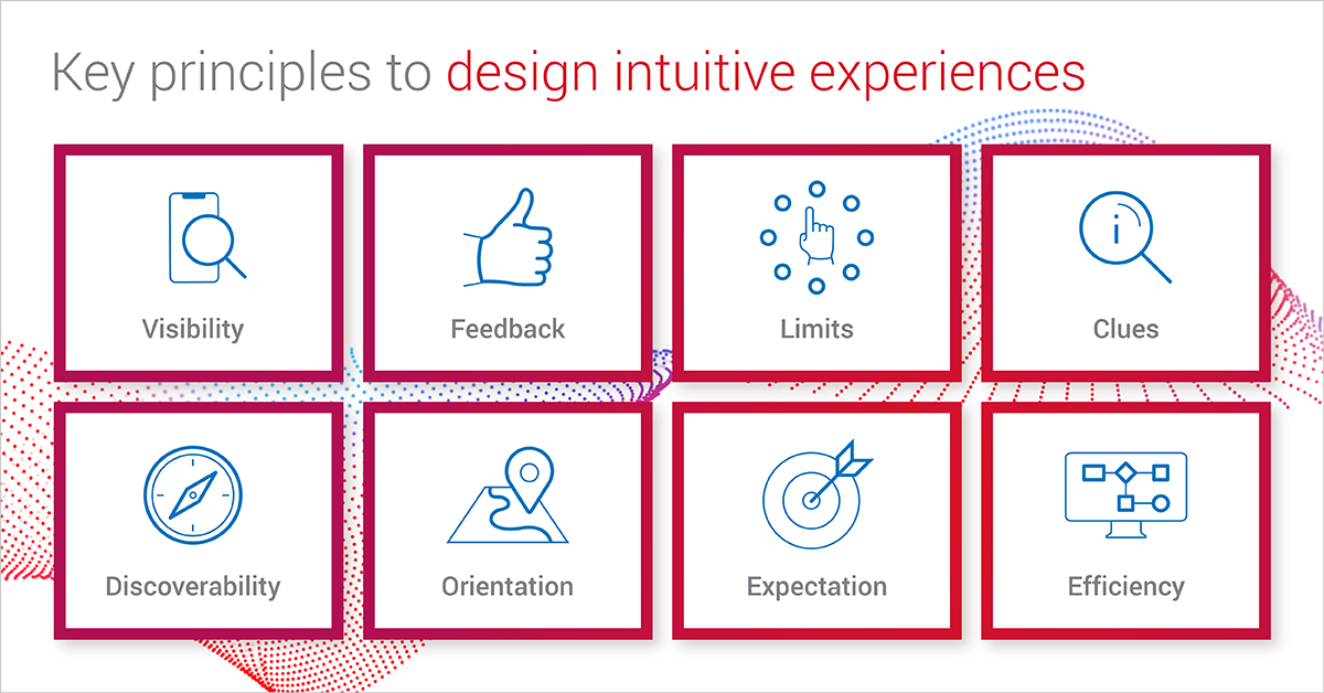
When it comes to roadside, this means that it is easy for the user to understand how to start, and what information is needed. It also means that they can efficiently and correctly enter their request so that the right support can be dispatched. Our focus on outcomes helps guide this design effort.
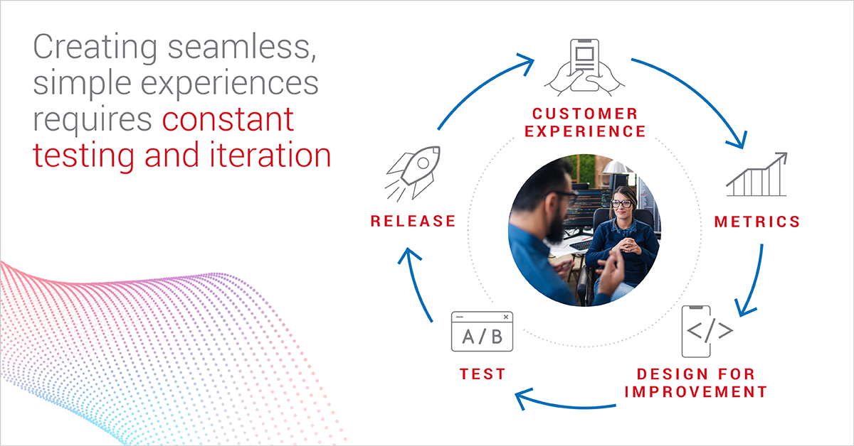
Designing things to be simple is really hard (and constant). Design, Test, Measure, Repeat.
User experience design is just step one. Creating seamless, simple experiences requires constant testing and iteration. At Agero, we first released our native digital intake, mobile web and web app in 2018. We have had a team working continuously since then to test features - like placement, color, or wording to streamline the customer experience and to drive outcomes.
With each change, we run controlled experiments to see what the impact is on key metrics like total customer experience time. This includes simple changes like the placement of a search bar to clues like, “where is my VIN.” We operate in 2 week sprints, release bug fixes, design iterations and improvements more than 20 times per year.
If you are creating your own digital intake experience, set a strong foundation by prioritizing key functionalities like coverage look up and job details, and make sure that customer experience implications are carefully considered. Also, be sure to allocate time and resources to incorporate visual and design updates - small changes can make a big difference when it comes to customer experience.
But wait there’s more: New features and capabilities
In addition to iterations to streamline the workflow and the experience, the needs of roadside assistance are constantly evolving. This can be industry changes like the exponential growth of electric vehicles or new technologies, like chat. The ideal digital process ensures that the request can be quickly and easily entirely entered by the customer without delays or follow up calls.
By looking at the current app performance, we can identify issues that cause friction for the customer, impacting their experience time and satisfaction. Two recent examples were identifying a tow location and customer payments. For many customers, these created barrier to their fully digital experience, leading to follow up calls and delays.
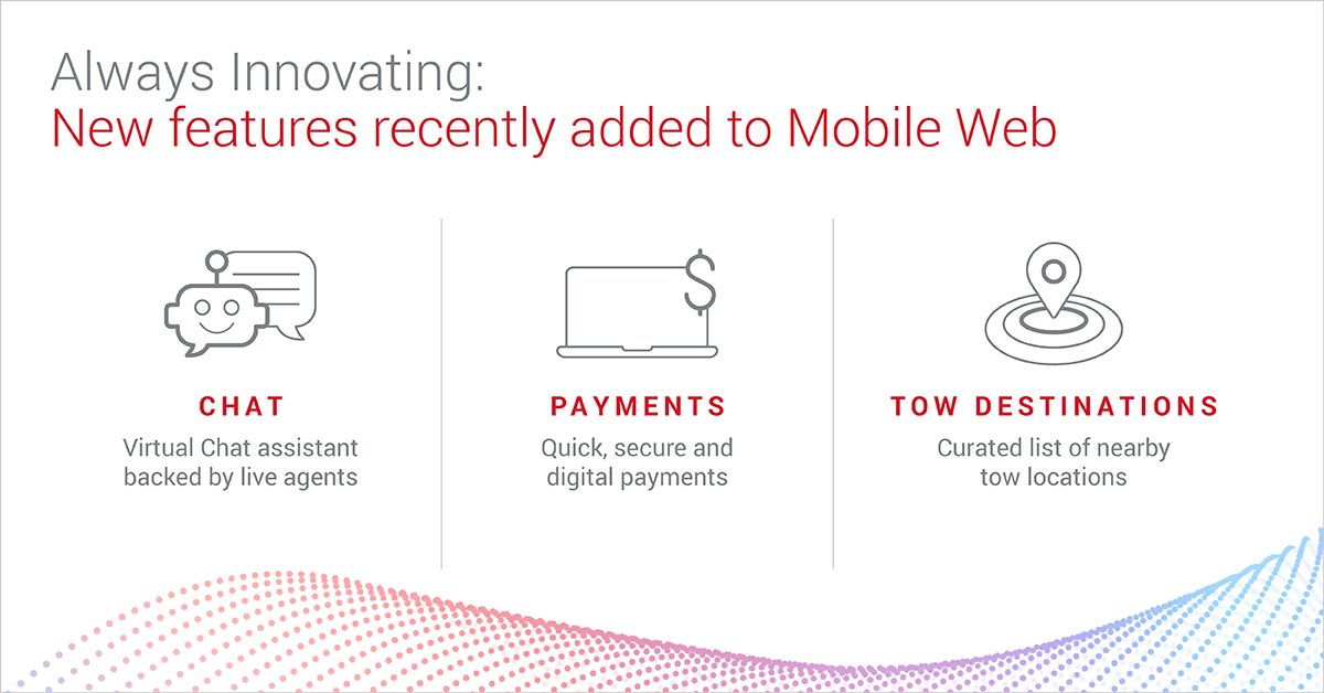
We recently incorporated these updates into our mobile web and web app to reduce friction and simplify the process:
- Chat: If a customer has questions or needs assistance when entering a digital request, chat is a great option. We’ve designed our chat to gather key information and attempt to assist the customer through AI. However if needed, the customer is seamlessly connected to a live chat agent.
- Payments: In the event that a customer payment is required, they can quickly and securely enter payment details through mobile web. This takes time and hassle out of the intake process.
- Tow Destinations: Customers often don’t know where to have their vehicle towed, adding stress and uncertainty to the situation. Suggested tow destinations are incorporated into mobile web and available through our API. A list of nearby vetted facilities is presented to customers as part of their digital intake.
Development of a quality digital channel requires investment in robust new features to meet changing needs. Be sure to allocate time and resources to add new features and capabilities.
Behind the scenes: Security, performance and robustness are critical to your customer experience
Customers expect responsiveness. In fact, more than 80% of customers expect their apps to load in less than 2 seconds. They also trust that their personal information, location and details are handled securely. And the expectation for up time has never been higher. It is important that your team is able to dedicate resources to ensure your backend functions swiftly and securely. .
For our native intake channel, mobile web, we leverage subscriptions to ensure quick updates, at scale. Subscriptions are a feature within our Client API that enable access to updates on jobs. With subscriptions, you can request live updates on jobs based on a specific trigger like a status change.
We also leverage third party payments to ensure the safety and compliance of customer payment information. In addition, we automatically monitor all our systems and supporting systems so that we can detect potential issues and avoid disruptions in service.
Develop vs. Partner: Building exceptional customer experiences for roadside requires investment, but don’t worry - we’re investing every day.
Building exceptional branded roadside experiences supports your customers and your brand but it requires a commitment of resources and technical expertise. If your team is not ready to take this on, no worries! We can take care of all the heavy lifting for you with our native intake solutions. Learn how to take advantage of mobile web in all your digital channels today!


 Daniel Yang is a Product Manager on the Swoop Platform team. His current focus is on Intake Solutions. This includes the development of Agero's native digital intake, Mobile Web and the API for client integrations. Daniel joined Agero in 2021 and is based in the San Francisco area. Prior to Agero, Daniel worked as a Product Manager at Sentieo and a Senior Consultant at Ernst & Young. In his spare time, Daniel enjoys baking bread, volunteering, and reading. He has a B.S. in Business Administration from the University of Southern California.